Where is the Architecture?
Some long term residents in Los Angeles cringe at the sheer number of multi-family apartments going up all over town. The increase in high density urban living was inevitable - Los Angleles had used up every inch of land in a commutable distance from Los Angeles city, and commuter traffic was at a standstill. My friends worry about more street or "surface" traffic that may grow worse as density increases, and they worry about loss of community identity. It's not fashionable, in certain artistic circles around L.A., to like high density and new apartment apartment complexes, but I don't really agree. With everything factored in, particularly the damage that sprawl has done to the environment, it's better this way and we will get better at doing it.
One thing that happens photographing architecture is that over time, you begin to develop a new sensitivity to the way space merges with light into a single phenomenon. When I am in it, it is a beauty that I can feel as much as see. When I encounter this in a building, my pace quickens with a sense of anticipation. It's like striking gold, but it is deceptively simple – airy and graceful.
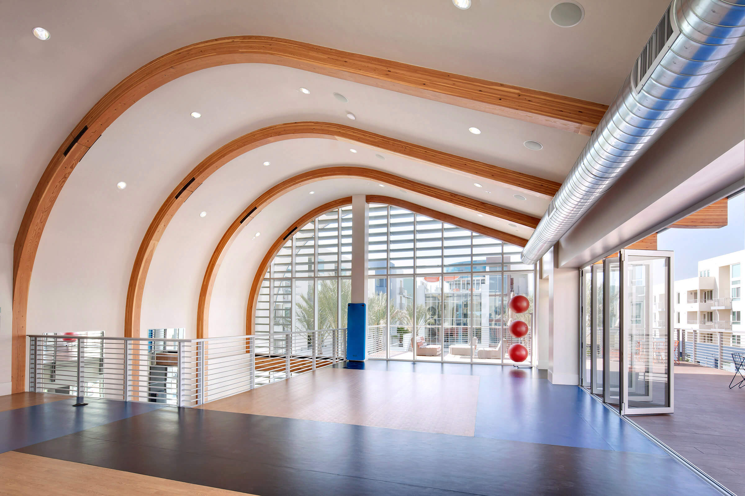
The first time I walked into the Boardwalk Apartments stretch room I felt it, but I remember thinking "it can't be this easy - shooting this will require no effort because its going to look like this most of the day", or "this room can't be this beautiful - it's just an apartment complex." This misjudgement led to a circuitous search for something different, which led to shooting in late afternoon - when bright sun slants in through the doors at right, an unnecessary high-contrast mistake, which led to a trip back down to Huntington Beach at no charge to the client to re-shoot the easiest possible way, and get it right.
This is a room that effortlessly invites soft natural light into it. The surrounding buildings act as reflectors, the high arched ceiling and open wall inhales the light and bathes you in it. It's a room that makes you feel like you are outdoors in the cool shade on a hot day. The best possible photographic solution is to preserve what contributes to this sense of light - the ceiling, the buildings in the background, the open door, the gleam on the floor - and exclude absolutely everything and anything else. With this commitment the framing for the shot becomes very clear and explicit - nothing can be included that will interfere. The best time was mid-morning, when the sun was shining on the buildings in the background and to the right outside the frame of the image.
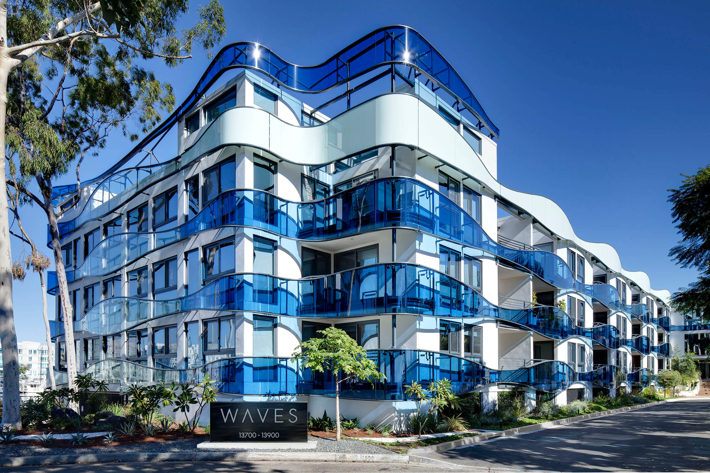
The Waves Apartments in Marina del Rey was a make-over of a bland stucco building from the 60's by Los Angeles architect Michele Saee. With it's elaborate wrap-around glass bands, this building defied the usual rules of light. The blues in the glass were transformed by direct sunlight, regardless of the time of day, and illuminated the buildings as though they were plugged into an electric current. The illumination matched the blue of the waters surrounding it on the Marina. Anywhere else but by the sea, it would be too much, but here the brilliance of the glass resonated with the sun and water around the site. This image was taken at noon - the time when almost all other buildings with opaque surfaces go lifeless and flat and the time of day when I normally cannot shoot exterior images.
There are distractions when shooting architectural work. Spaces and details often vie for attention. There are a lot of images to get done. Some rooms or some views that seem necessary for documentation are impossible to shoot well, simply because they die, visually, in an image. One thing I keep in the back of my mind while scouting, shooting and editing is a very obvious question, but a necessary one: Where is the architecture? Usually it has to do with the other question: Where is the light?

