Modulation and Nuance
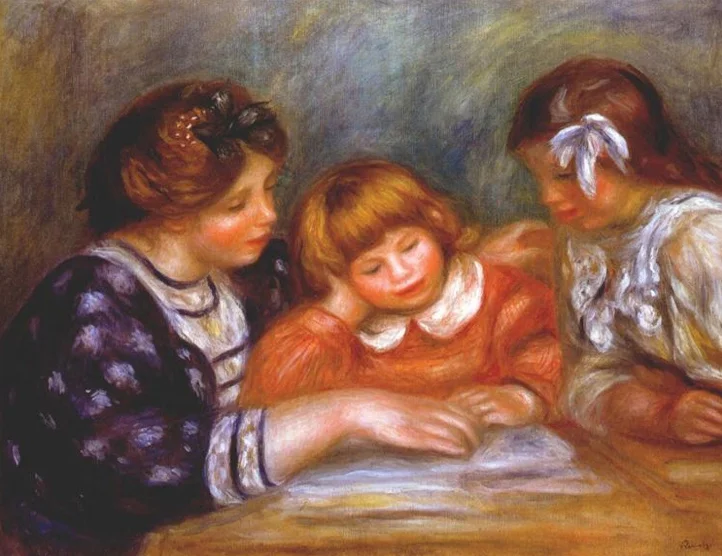
Pierre-August Renoir painted “The Lesson” in 1906. By the 20th century if not sooner, skilled painters could compress and expand spatial relationships in the same way photographers manipulate perspective by varying the focal lengths of our lenses. This painting is structured as though it was seen through a 150 - 200 millimeter lens.
Notice the point of view of the “camera”, which is lower than someone standing near the table looking down, but slightly higher than the woman and the girls – that of a tallish person (maybe Renoir) sitting in a chair close to the table, but not at the table: close to the scene but not part of it. The compressed “telephoto” perspective brings the lesson closer to the viewer giving it more intimacy and detail, while it flattens out the form and presents it with more graphic strength.
What is so striking here is the fullness and generosity of form that occupies the frame, filling it with a shimmering light that is modulated across the surface of the image. At left, the image is very dark, then it brightens along the front of the woman and across her cheek as well. Her enormous, oversized wrist and hand are illuminated, as is the face of the youngest girl, and her collar. The bow in the older girl’s hair and the scarf around her neck is very bright. The rest of the painting falls into the mid-tones except where much darker colors anchor the painting at left.
This is not quite how light works in the real, ambient world. The light in this painting is a strong diffuse light, but the highlights and shadows do not correspond with each other as they would in a photograph. With just the right diffusion and directional intensity, natural light could be something close to this in contrast, if the table were near a large window, but most of the nuances in the highlights of the image were enhanced, not according to some rule Renoir had in his head, but because this is the way it felt to be in the room. This is the way the scene felt to him.
This painting was made in a time when photography and painting were learning from each other. Photography now has the plastic flexibility that painting did, making it possible to re-distribute highlights and shadows across the surface with more power of feeling. (see my post: Feathered Masks). Besides the huge impact that digital tools have had in making the photograph a more plastic medium, painting has also impacted photography in its current use of the staged tableaux as a pictorial device. I'll cover that in a later post.
